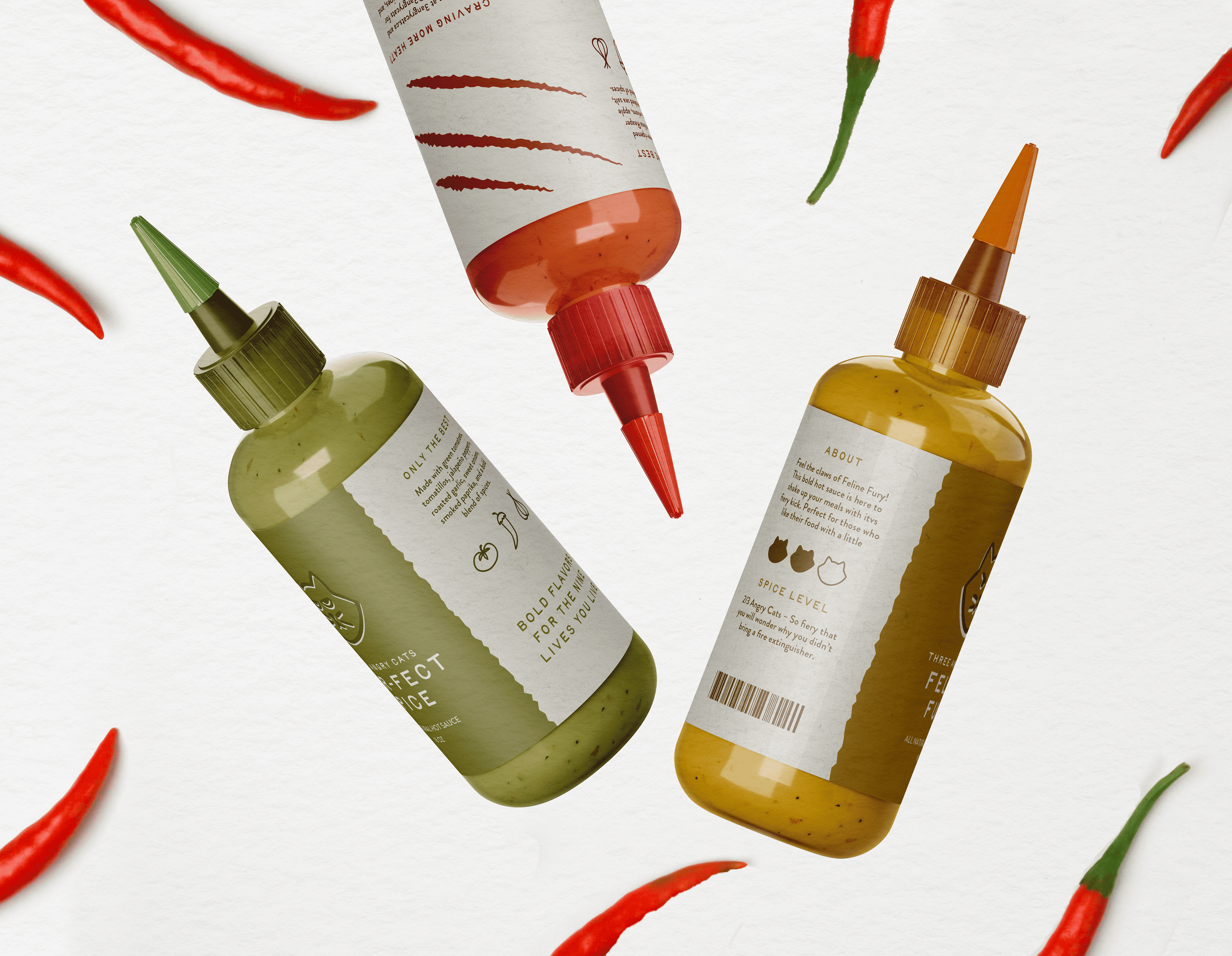
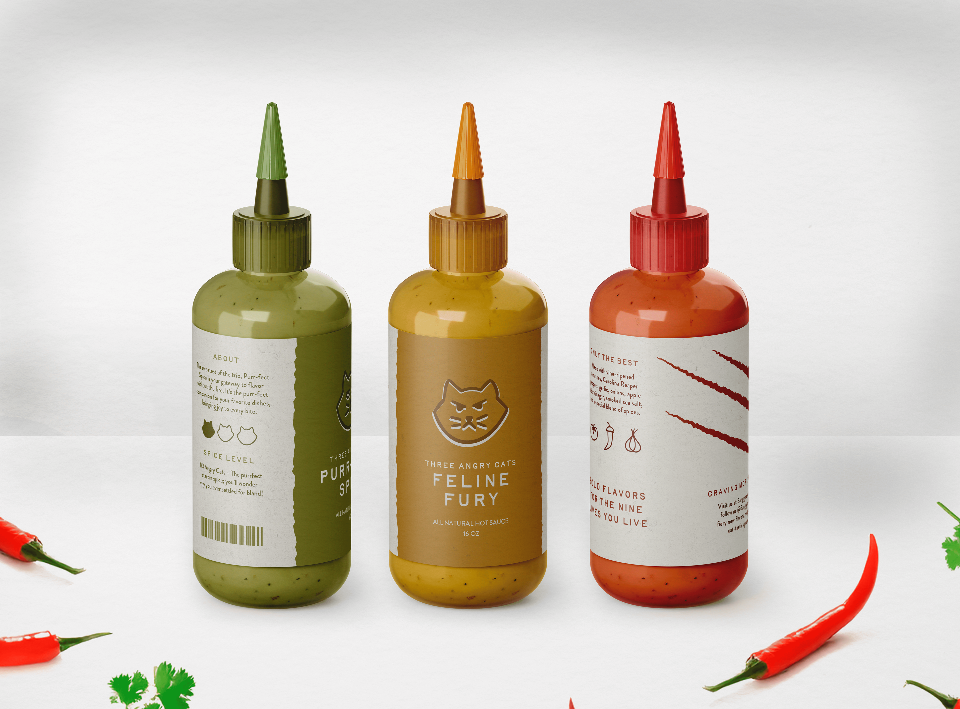
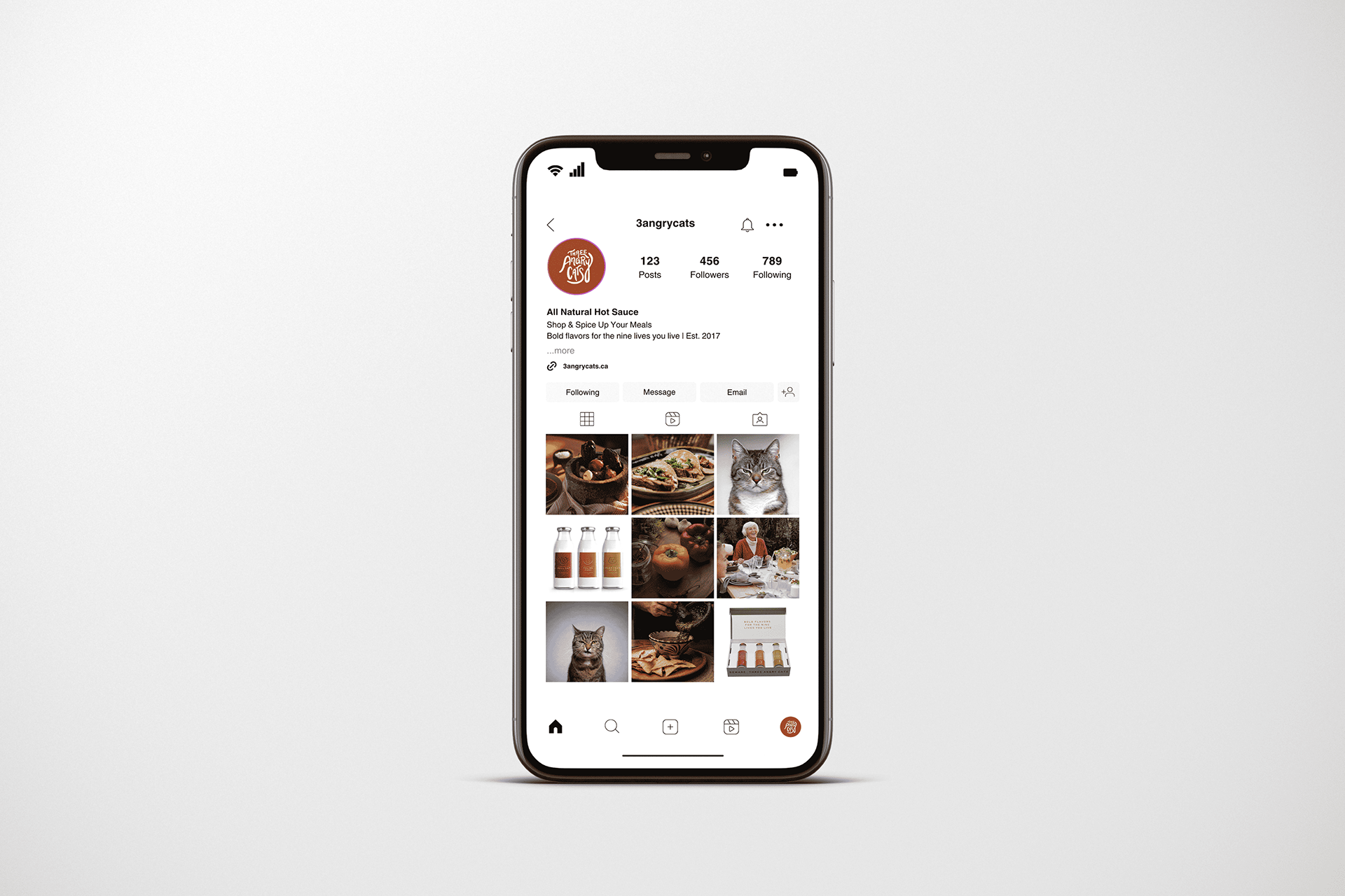
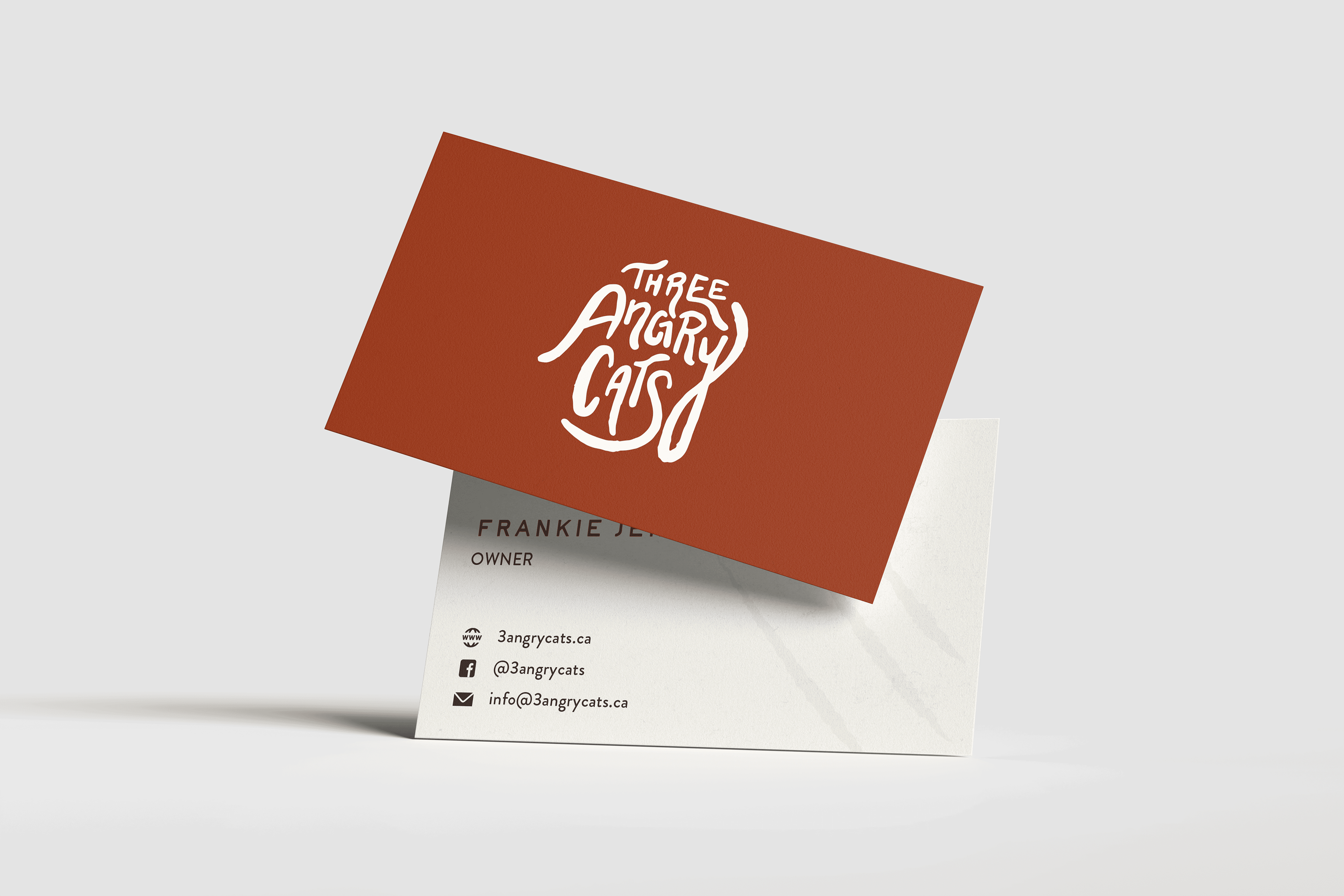
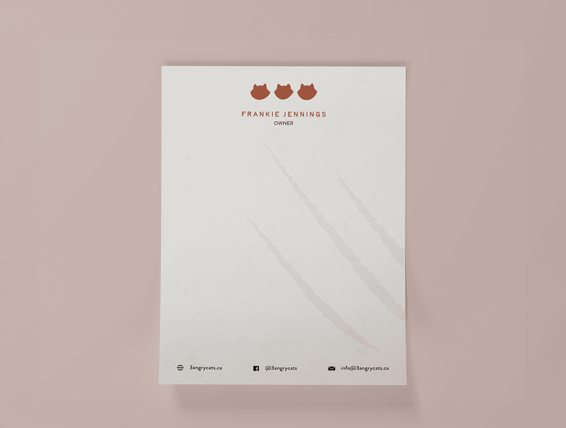
This rebrand concept for Angry Cats brings energy and boldness to the brand’s playful, homemade identity. The rough-edged logo and the hand-lettered look of the typography emphasize the artisanal quality of their sauces, while the vibrant color palette of burnt orange, vibrant green, and off-white adds a lively, fiery touch. The hand-drawn illustrations of the three cats, each with distinct expressions—mild to steaming mad—symbolize the range of heat in the sauces, adding humor and character. The rebrand captures the essence of Angry Cats, reflecting their commitment to bold, fresh flavors with a fun, passionate visual identity.
