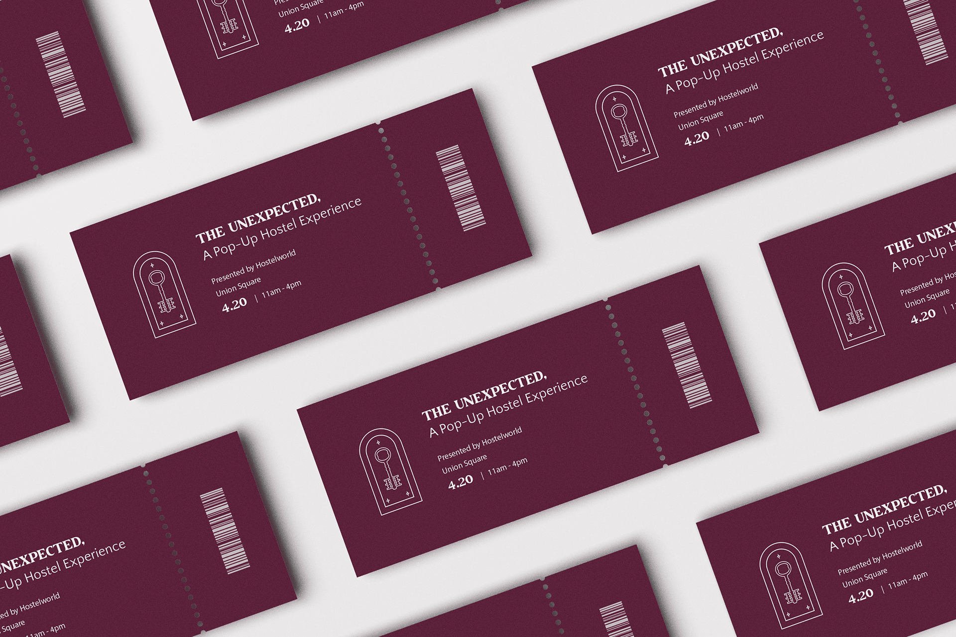
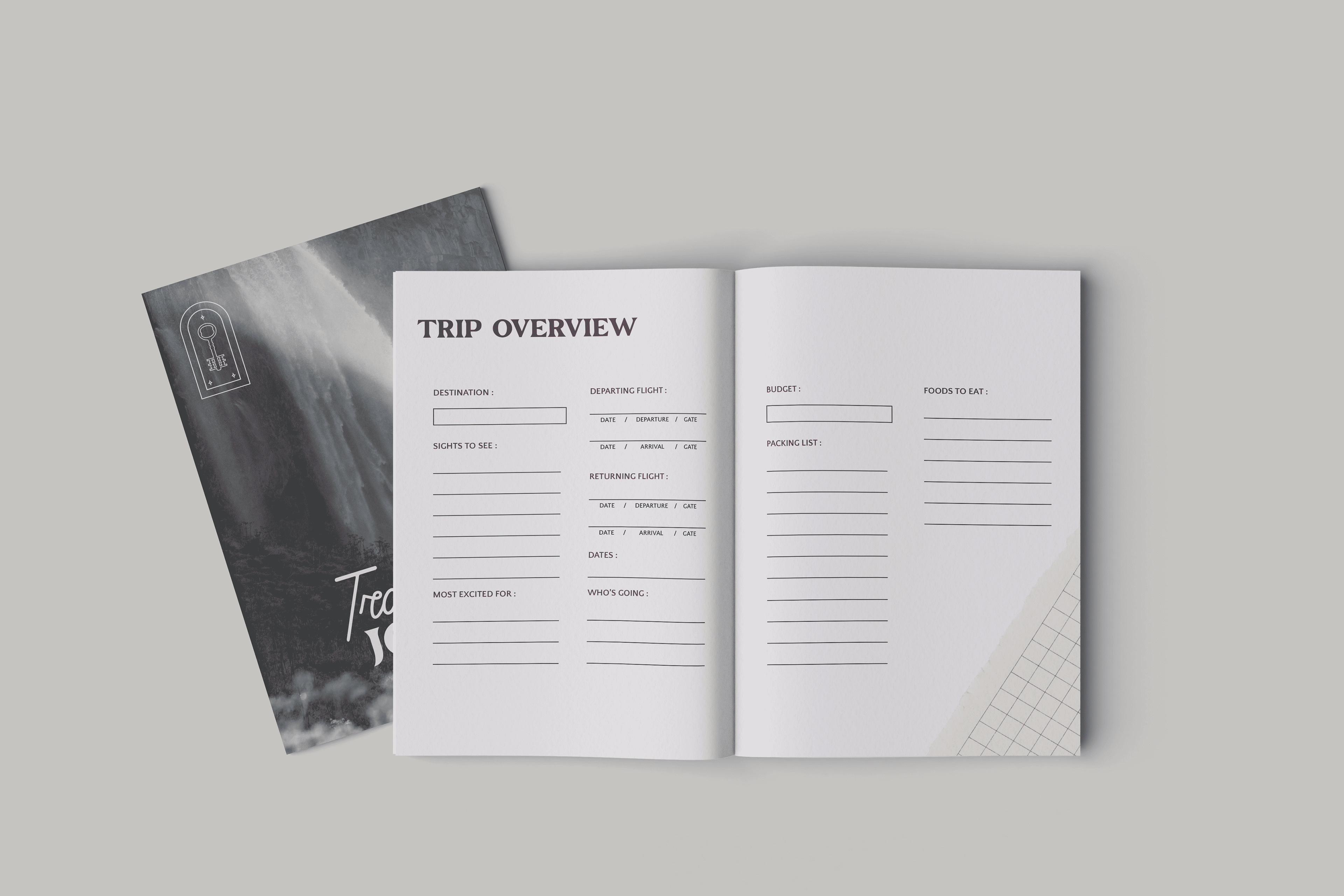
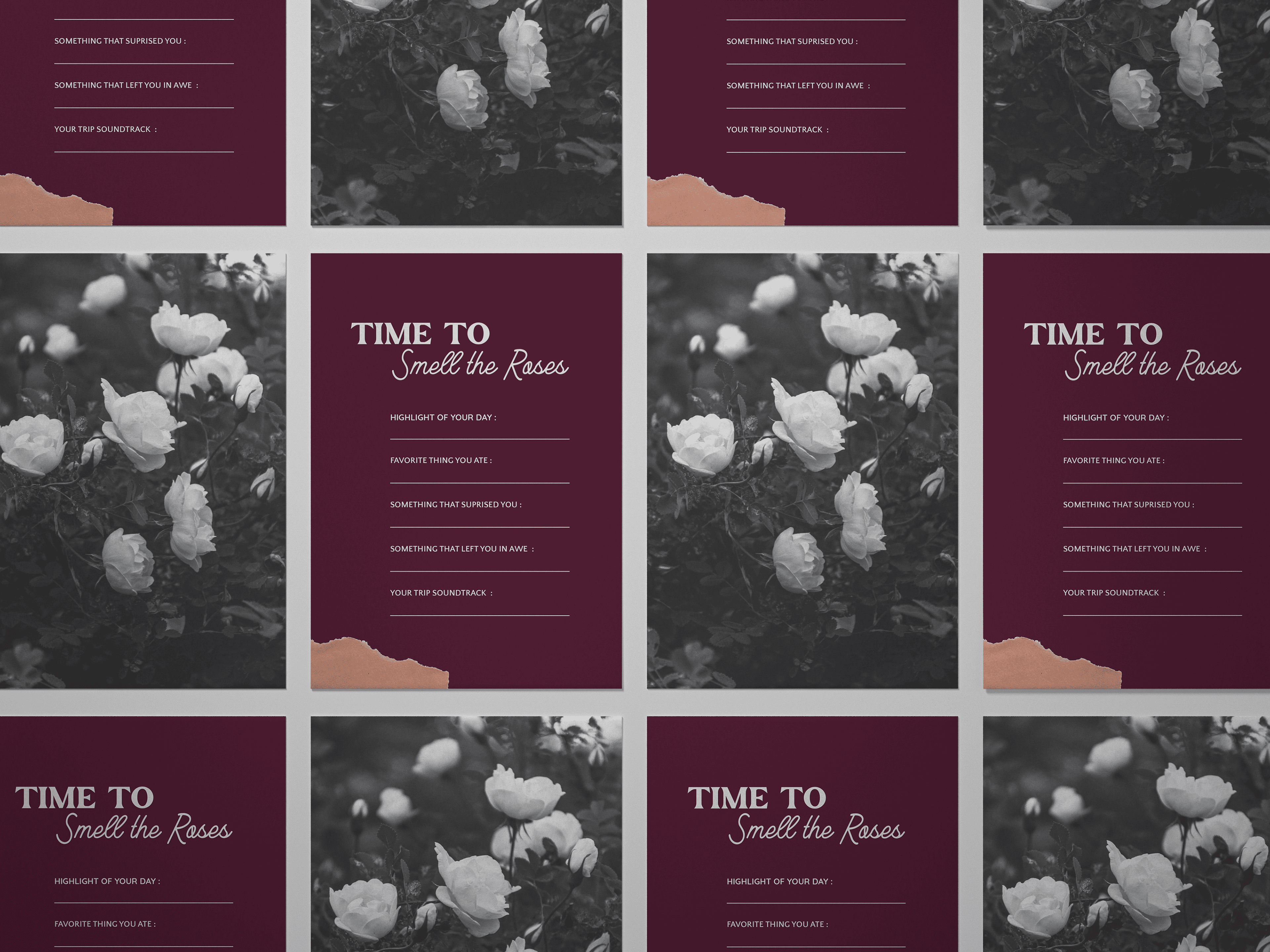
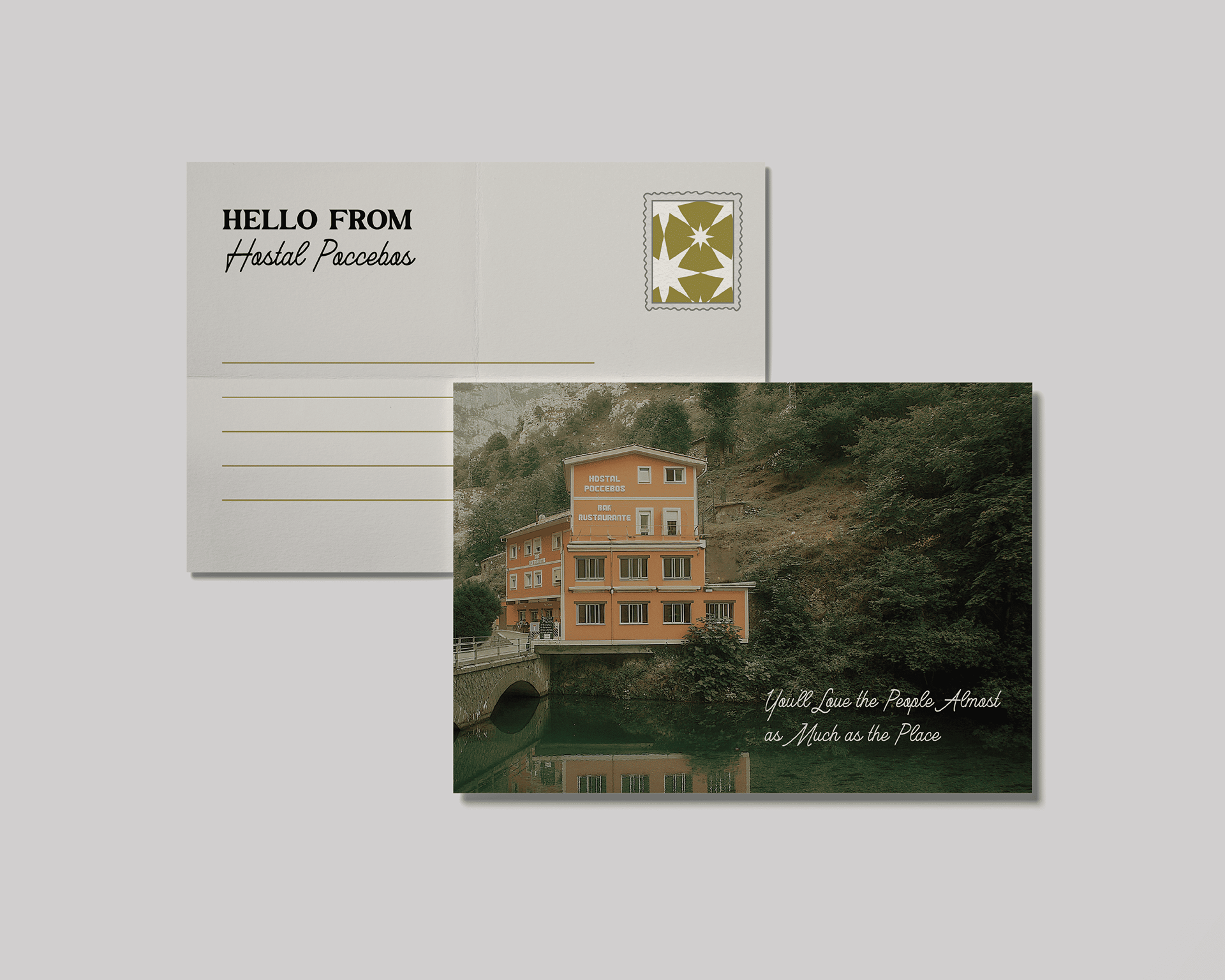
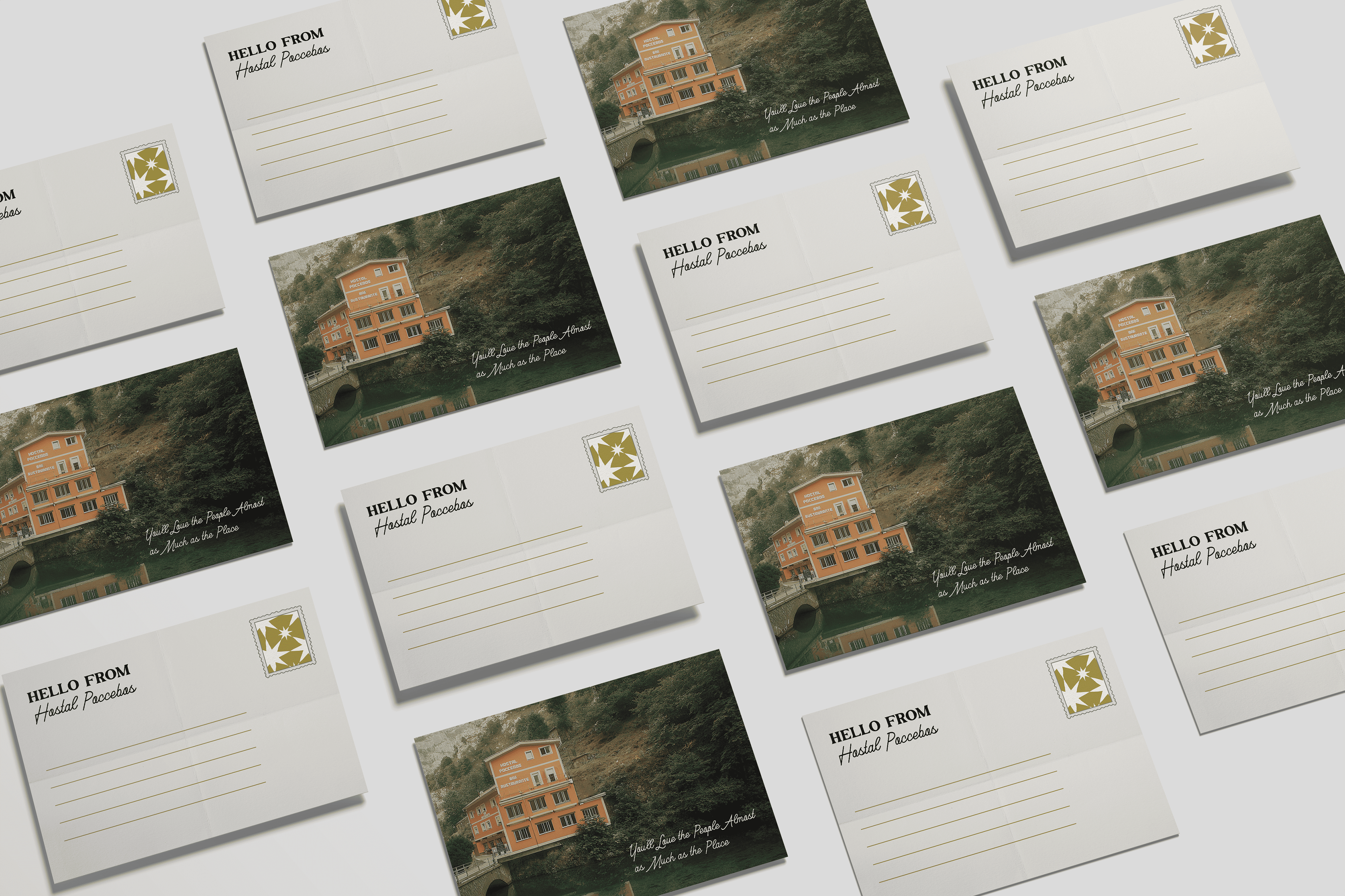
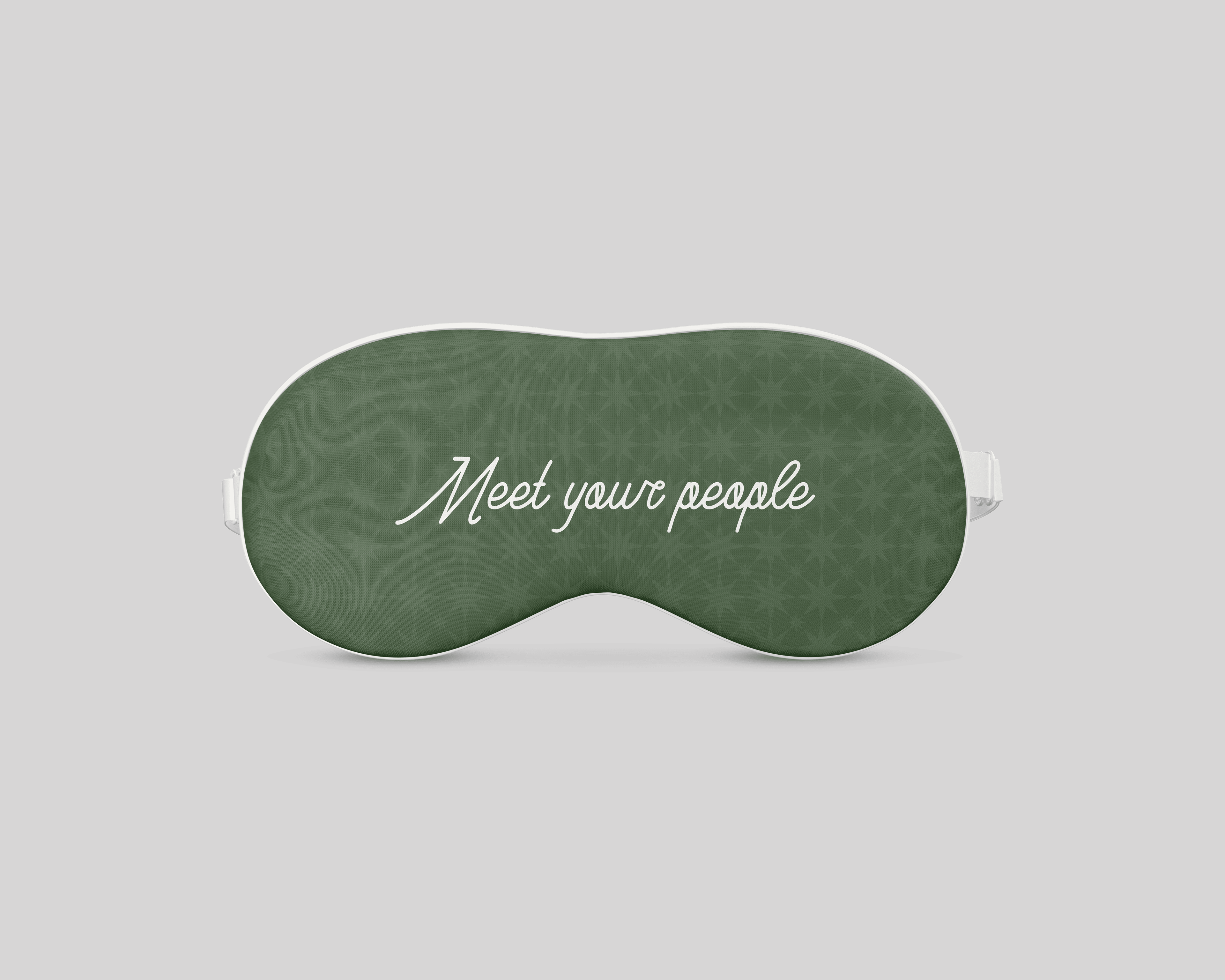
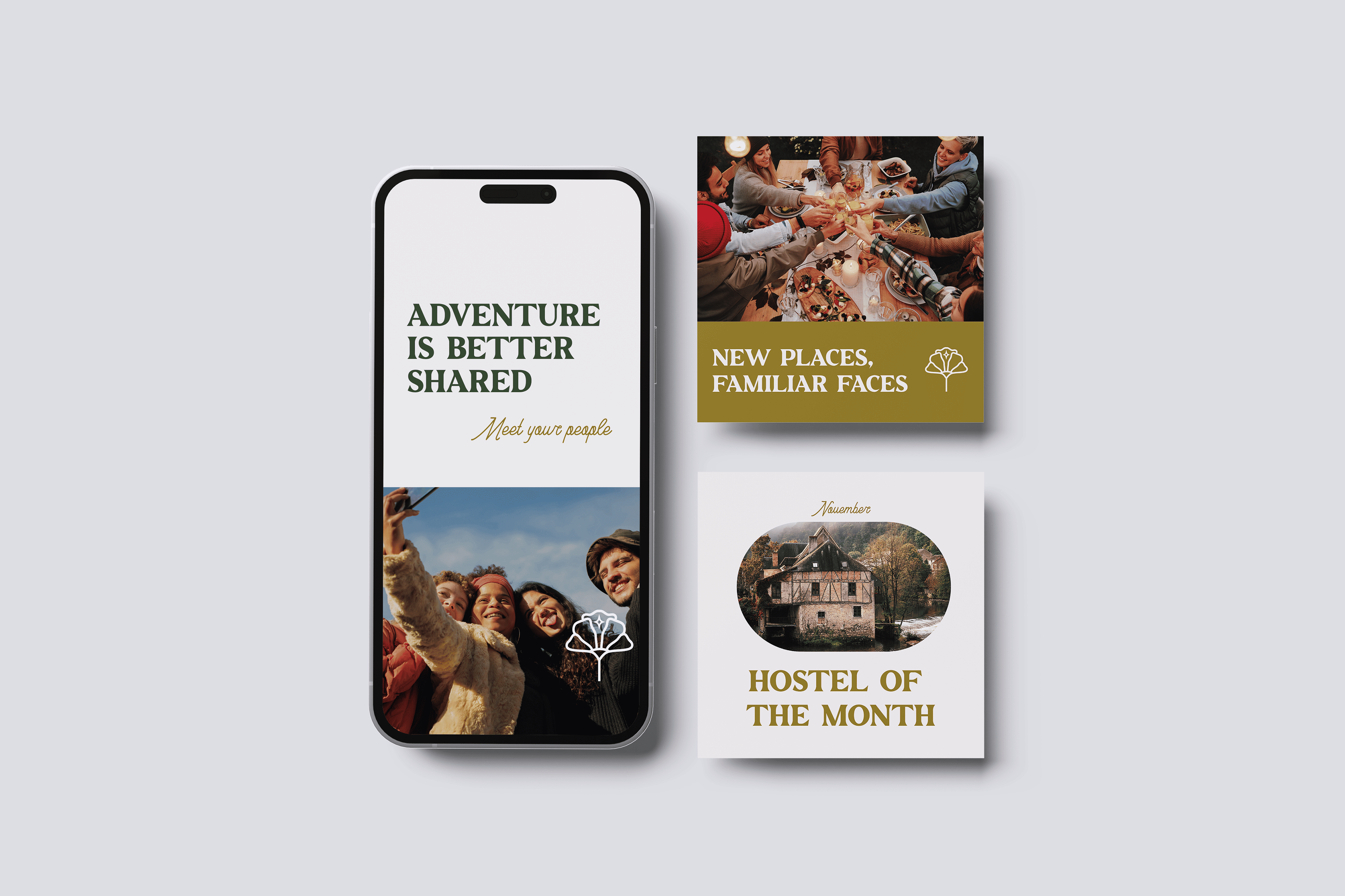
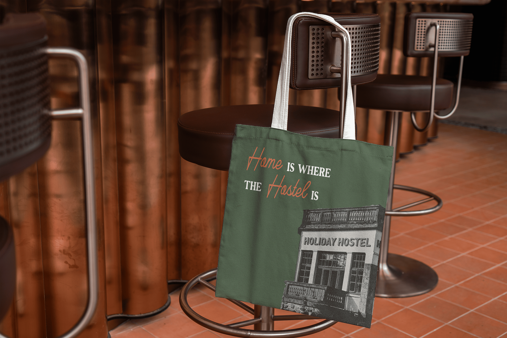
Hostelworld’s rebrand repositions the brand as a welcoming, global community for travelers seeking connection. The arched logo, inspired by European doorframes, features stars and floral motifs, symbolizing shared experiences. A refined yet playful color palette moves away from the spring-break feel, bringing warmth and sophistication. Tile-inspired patterns add a handcrafted touch, while a subtle paper texture evokes postcards and memory-making. Every element works together to create a brand that adventure, connection, and a sense of belonging.
The Unexpected Campaign Concept
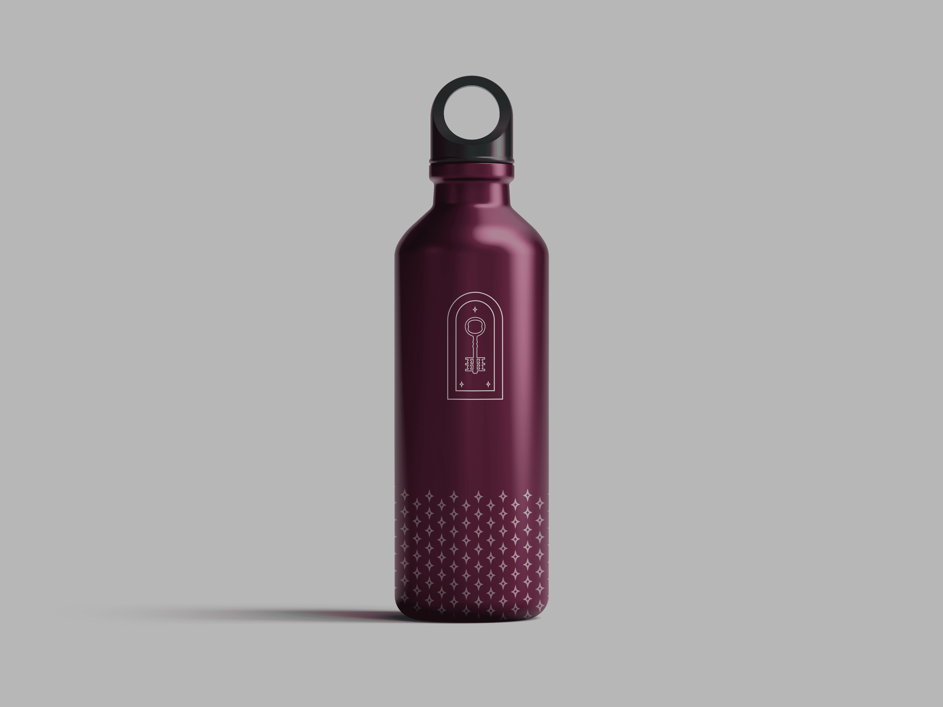
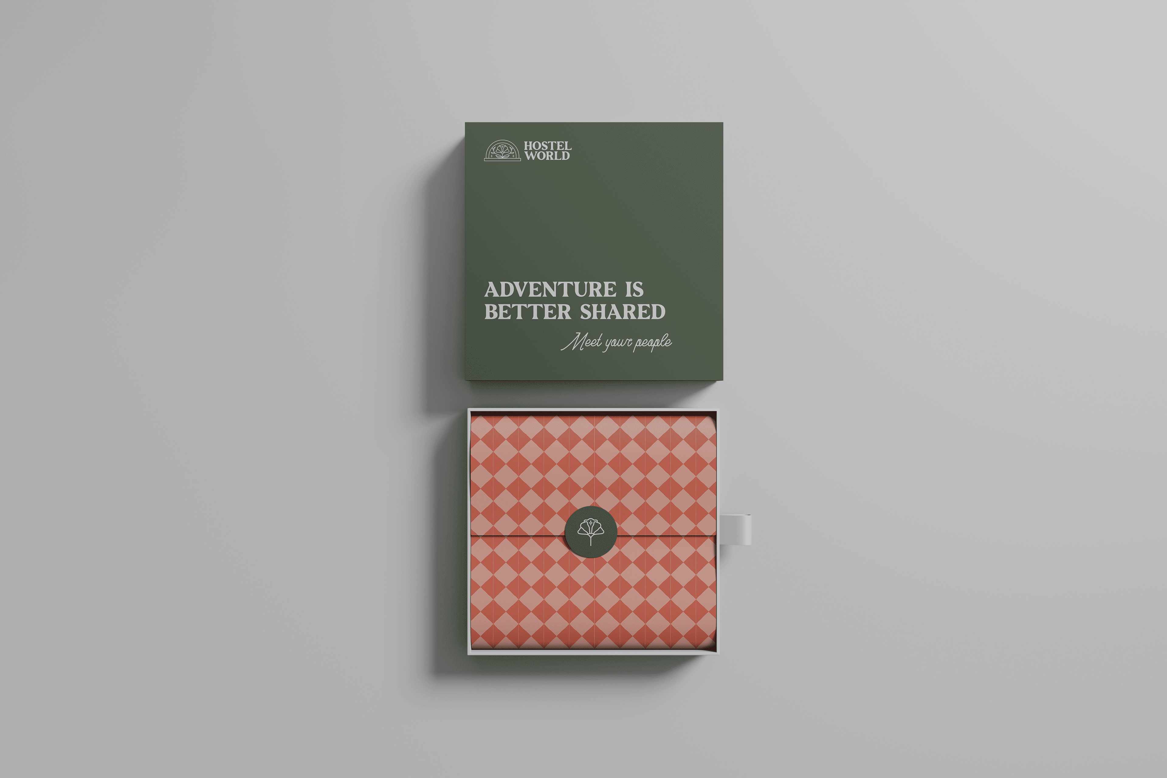
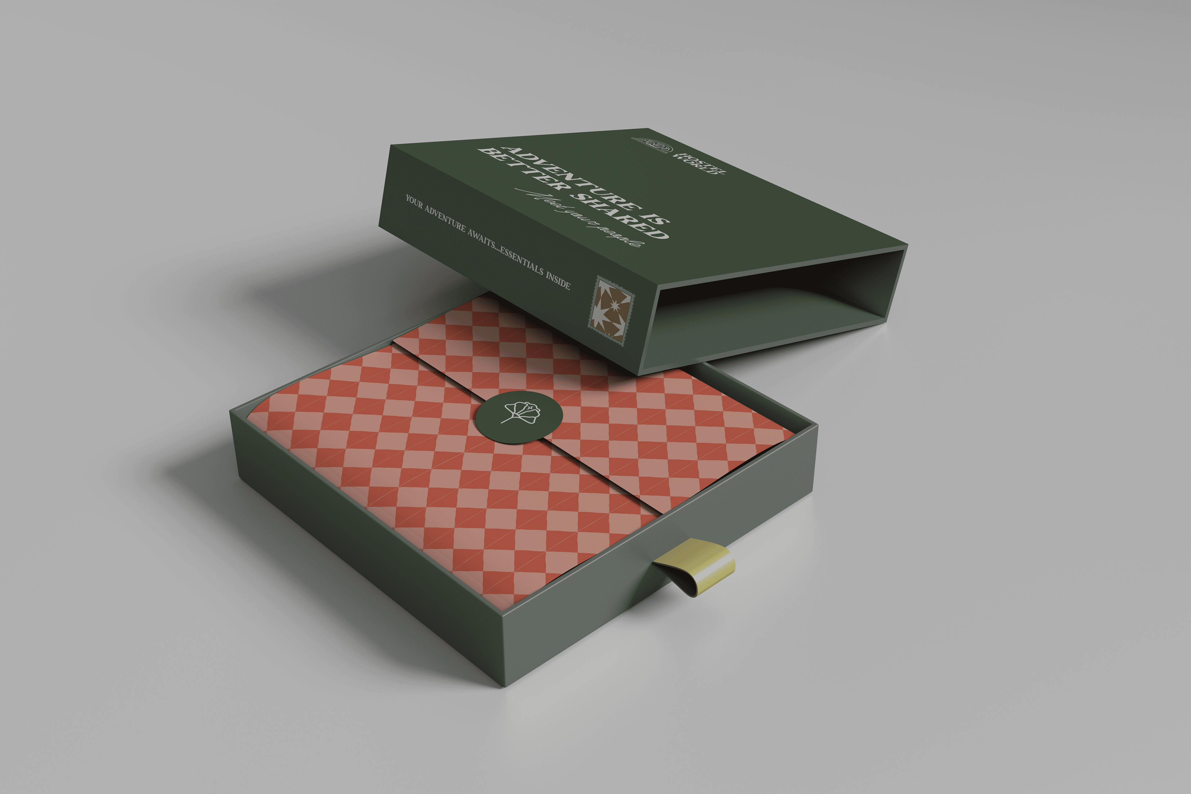
This campaign redefines hostels, breaking stereotypes and showcasing them as vibrant hubs of adventure and connection. The key and arched doorway logo symbolizes unlocking new experiences, while bold new colors amplify the campaign’s playful, satirical tone. A myth-busting landing page challenges misconceptions, shifting the focus to comfort, community, and spontaneity. At the heart of it all, the pop-up hostel offers a firsthand look at hostel life, turning perceptions into experiences. Guests leave with the Special Edition Hostel Survival Kit, a lasting reminder that the best moments are often the most unexpected.
